Lettering is the discipline that exposes everything. A four-millimetre stroke has nowhere to hide a hesitation, and the result is permanent. It is also, for exactly those reasons, the best possible training for control.
Draw at full size, and draw accurately
Every lettering problem starts as a drawing problem. If the spacing is wrong on the drawing, no amount of careful cutting will fix it, and the error will be visible from across the room for the life of the stone.
- Draw the inscription at full size on the stone itself, not on paper.
- Set the spacing by eye at the actual size — optical spacing beats mathematical spacing every time.
- Check the letterforms against a reference. Stone lettering has its own proportions, and they are not the same as type.
- Cut a test inscription on an offcut before you commit to the real stone.
The V-section stroke
The classic carved letter is a V-section: two angled cuts meeting at the bottom of the incision, wide at the surface and narrow at the depth. This profile catches light in a way a square-bottomed groove does not, which is why inscriptions read clearly in raking light.
Score the centre line
A light pass down the middle of the stroke establishes the guide and prevents the chisel from wandering.
Cut the first side
Angle the chisel to one side of the centre line and drive a controlled cut to depth.
Cut the second side
Mirror the first cut on the other side. The two cuts meet at the bottom.
Clean the apex
A light pass with a narrower chisel removes the burr at the bottom of the V.
Check the depth is consistent
Run a finger down the stroke. Any change in depth will read as a flaw in raking light.
Relief carving: lowering the ground
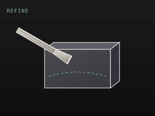
In relief, the figure stays at the original surface and everything around it is lowered. The ground is the background plane, and getting it genuinely flat is the whole challenge — a ground that undulates makes the relief look amateur regardless of how well the figure is carved.
- Draw the outline of the figure at full size and cut the outline cleanly first.
- Lower the ground in stages, working outward from the figure.
- Stop regularly and check the ground with a straightedge against raking light.
- Leave a small margin around the figure and blend it in last — this is what stops the figure looking pasted on.
- Work the figure only after the ground is finished. Dust and chips from the ground will damage finished detail.
Tool choices for lettering
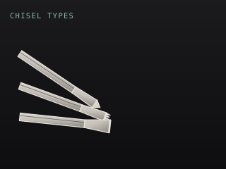
A lettering chisel is essentially a very narrow flat chisel with a tapered shank, struck with a light mallet. A V-tool handles the outline of relief and the separating lines. A flat chisel does the bulk of the ground lowering, and a riffler blends the margin between figure and ground.
“Noob Starter Kit?”
Sharpening for lettering
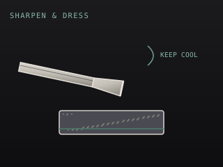
Lettering requires a sharper edge than any other stone work, and it requires it more often. Expect to sharpen several times during a single inscription. The edge should be polished to a mirror on a fine slip stone — a toothy edge will tear the surface of the incision and leave a rough wall that shows in raking light.